POSTحركةMotion
Scroll-driven animations في CSS: حركة مع السكرول من غير جافاسكريبتCSS scroll-driven animations: scroll motion without JavaScript
شرح animation-timeline و scroll() و view() بأمثلة تنسخها، وإمتى تكفيك وإمتى لسه محتاج GSAP ScrollTrigger.animation-timeline, scroll() and view() with examples to copy, and when they are enough versus when you still need GSAP ScrollTrigger.
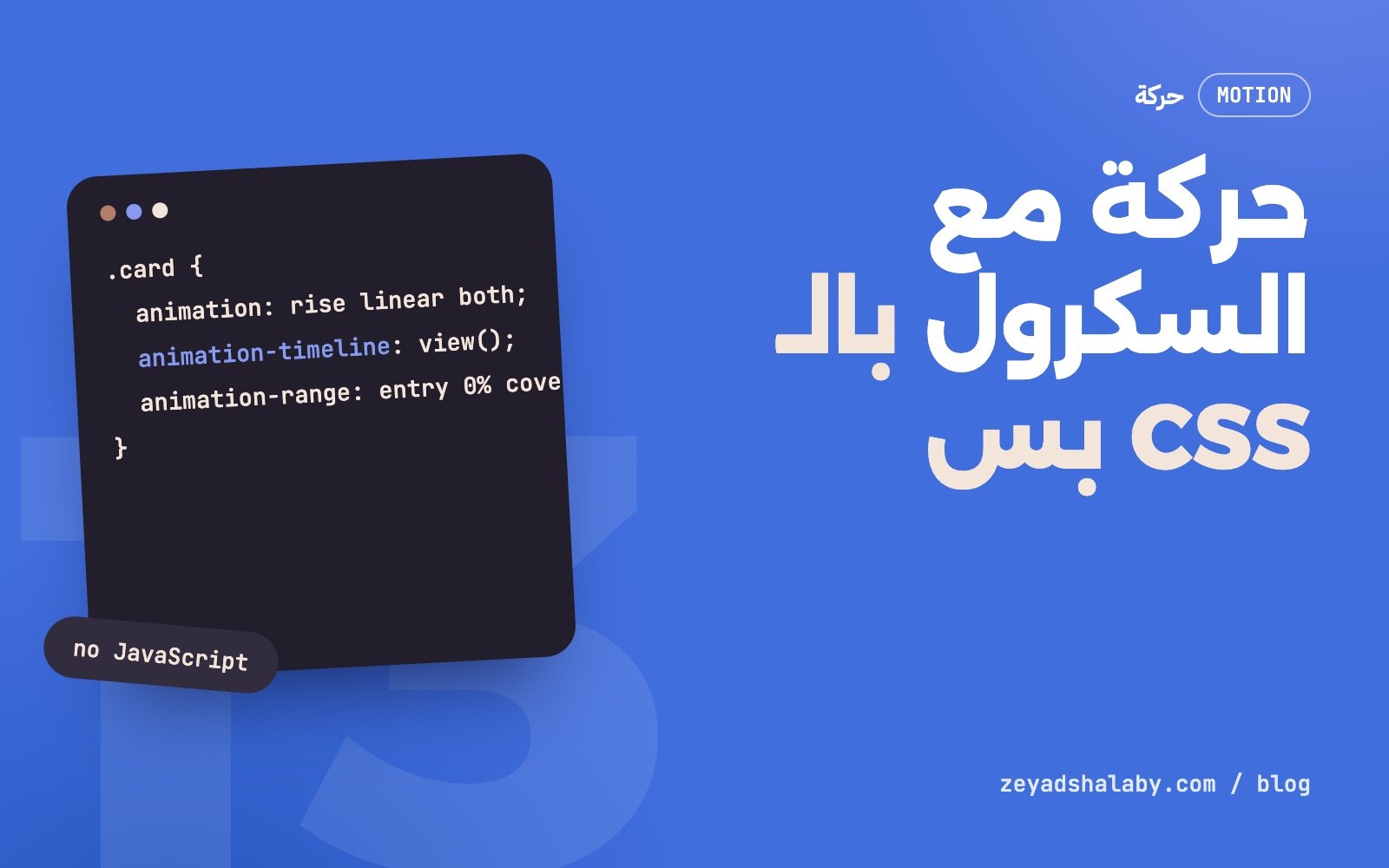
Scroll-driven animations ميزة في CSS بتخلي أي @keyframes تمشي مع السكرول بدل ما تمشي مع الوقت. بتكتب الحركة عادي، وتضيف سطر واحد: animation-timeline. من غير جافاسكريبت، من غير مكتبة، ومن غير ما تسمع لحدث scroll. والحركة بتشتغل بره الـ main thread، فبتفضل ناعمة حتى لو الصفحة مشغولة.
الفكرة: الوقت بقى سكرول
أي حركة CSS عادية ليها خط زمني: بتبدأ عند 0% وتخلص عند 100% بعد مدة معينة. الميزة دي بتبدل الخط الزمني ده بحاجة تانية:
scroll(): التقدم هو مكانك في السكرول. أول الصفحة 0% وآخرها 100%.view(): التقدم هو مكان العنصر نفسه في الشاشة. أول ما يبدأ يدخل 0%، ولما يخرج خالص 100%.
الأولى للحاجات المرتبطة بالصفحة كلها. التانية للحاجات المرتبطة بعنصر معين.
مثال 1: شريط تقدم القراية
.progress {
  position: fixed;
  inset: 0 0 auto 0;
  height: 4px;
  background: #416EDD;
  transform-origin: 0 50%;
  animation: grow linear both;
  animation-timeline: scroll(root);
}

@keyframes grow {
  from { transform: scaleX(0); }
  to   { transform: scaleX(1); }
}
ده كل اللي محتاجه. تلات ملاحظات:
linearمهمة. أي easing تاني هيخلي الشريط يسبق أو يتأخر عن السكرول.- مفيش
animation-duration. المدة مالهاش معنى هنا لأن السكرول هو اللي بيحرك. - في صفحة عربي، خلي
transform-origin: 100% 50%عشان الشريط يبدأ من اليمين.
مثال 2: عنصر يظهر وهو داخل الشاشة
.card {
  animation: rise linear both;
  animation-timeline: view();
  animation-range: entry 0% cover 40%;
}

@keyframes rise {
  from { opacity: 0; transform: translateY(40px); }
  to   { opacity: 1; transform: none; }
}
كل كارت بيتحرك لوحده حسب مكانه هو. مفيش IntersectionObserver ومفيش كلاس بيتضاف.
animation-range: الحركة تبدأ وتخلص فين
ده الجزء اللي بيلخبط في الأول. مع view() فيه مراحل ليها أسماء:
entry: من أول ما حافة العنصر تدخل الشاشة لحد ما يدخل كله.exit: من أول ما يبدأ يخرج لحد ما يختفي.cover: الرحلة كلها، من أول بكسل يدخل لآخر بكسل يخرج.contain: الفترة اللي العنصر فيها جوه الشاشة بالكامل.
فـ entry 0% cover 40% معناها: ابدأ أول ما العنصر يلمس الشاشة، وخلص لما يقطع 40% من رحلته. لو عايز حركة خروج كمان:
.card {
  animation: rise linear both, fade linear both;
  animation-timeline: view(), view();
  animation-range: entry 0% entry 100%, exit 0% exit 100%;
}

@keyframes fade { to { opacity: 0; } }
دعم المتصفحات والحل البديل
الميزة مدعومة في Chrome و Edge من فترة، ووصلت Safari في الإصدارات الحديثة. دعم Firefox راجعه على caniuse قبل ما تعتمد عليها، لأنه بيتغير.
الطريقة الآمنة إن الحركة تتكتب كإضافة جوه @supports، والعنصر يبقى ظاهر عادي من غيرها:
@supports (animation-timeline: view()) {
  @media (prefers-reduced-motion: no-preference) {
    .card {
      animation: rise linear both;
      animation-timeline: view();
      animation-range: entry 0% cover 40%;
    }
  }
}
المتصفح اللي مش بيدعم بيشوف الكارت ثابت وظاهر. واللي قافل الحركة في نظامه نفس الكلام. ده أهم من أي حركة: المحتوى يظهر حتى لو الحركة ما اشتغلتش.
إمتى تكفيك وإمتى محتاج GSAP
الـ CSS يكفي لما:
- الحركة بسيطة: ظهور، إزاحة، شريط تقدم، parallax خفيف.
- كل عنصر بيتحرك لوحده.
- عايز أقل كود وأحسن أداء.
GSAP مع ScrollTrigger لسه لازم لما:
- تثبيت قسم (pin) والحركة ماشية جواه. الـ CSS يقدر يقرب بـ
position: sticky، بس التحكم محدود. - تسلسل معقد: timeline فيه عشر خطوات متداخلة بترتيب دقيق.
- أحداث: تشغل كود لما القسم يدخل أو يخرج، مش بس تحرك خاصية.
- scrub بنعومة: الحركة تتأخر شوية ورا السكرول وتلحقه.
- قيم محسوبة: الحركة معتمدة على مقاسات بتتحسب بالجافاسكريبت.
- دعم مضمون في كل المتصفحات من غير ما تفكر.
ابدأ بالـ CSS. لما تلاقي نفسك بتلف حواليه، ساعتها هات المكتبة.
أخطاء شائعة
- نسيان
both. من غيرanimation-fill-mode: bothالعنصر بيرجع لشكله الأصلي قبل وبعد المدى. - ترتيب الخصائص. الاختصار
animationبيصفرanimation-timeline. اكتبanimation-timelineبعده دايما. - تحريك خصائص غالية. خليك في
transformوopacity. تحريكwidthأوtopبيرجع الشغل للـ main thread. overflow: hiddenعلى أب. بيخلي الأب ده هو حاوية السكرول، فـview()بتتحسب عليه مش على الصفحة. استخدمoverflow: clipلو عايز تقص بس.- حركة على كل حاجة. صفحة كل عنصر فيها بيطلع من تحت بتتعب. اختار اللي يستاهل.
عايز حركة تانية من غير مكتبات؟ شوف View Transitions API: الوضع الليلي بدايرة بتكبر. ولو عايز تتعلم GSAP و ScrollTrigger للحالات اللي الـ CSS مش بيكفي فيها، ده اللي في كورس أنيميشن الويب بـ GSAP.
Scroll-driven animations are a CSS feature that makes any @keyframes progress with scroll instead of with time. You write the animation as usual and add one line: animation-timeline. No JavaScript, no library, no scroll listener. The animation runs off the main thread, so it stays smooth even when the page is busy.
The idea: time becomes scroll
A normal CSS animation has a timeline: it starts at 0% and ends at 100% after a duration. This feature swaps that timeline for something else:
scroll(): progress is your scroll position. Top of the page is 0%, the bottom is 100%.view(): progress is the element’s own position in the viewport. It is 0% as it starts entering and 100% once it has fully left.
The first is for things tied to the whole page. The second is for things tied to one element.
Example 1: a reading progress bar
.progress {
  position: fixed;
  inset: 0 0 auto 0;
  height: 4px;
  background: #416EDD;
  transform-origin: 0 50%;
  animation: grow linear both;
  animation-timeline: scroll(root);
}

@keyframes grow {
  from { transform: scaleX(0); }
  to   { transform: scaleX(1); }
}
That is all it takes. Three notes:
linearmatters. Any other easing makes the bar run ahead of or behind the scroll.- There is no
animation-duration. Duration is meaningless here because scroll drives it. - On an Arabic page, use
transform-origin: 100% 50%so the bar starts from the right.
Example 2: an element appearing as it enters
.card {
  animation: rise linear both;
  animation-timeline: view();
  animation-range: entry 0% cover 40%;
}

@keyframes rise {
  from { opacity: 0; transform: translateY(40px); }
  to   { opacity: 1; transform: none; }
}
Each card animates on its own according to its own position. No IntersectionObserver and no class being added.
animation-range: where it starts and ends
This is the confusing part at first. With view() there are named phases:
entry: from the element’s edge entering the viewport until it is fully in.exit: from when it starts leaving until it is gone.cover: the whole journey, first pixel in to last pixel out.contain: the period when the element is fully inside the viewport.
So entry 0% cover 40% means: start when the element touches the viewport, finish when it has covered 40% of its journey. For an exit animation too:
.card {
  animation: rise linear both, fade linear both;
  animation-timeline: view(), view();
  animation-range: entry 0% entry 100%, exit 0% exit 100%;
}

@keyframes fade { to { opacity: 0; } }
Browser support and the fallback
The feature has been in Chrome and Edge for a while and reached Safari in recent versions. Check Firefox support on caniuse before relying on it, since it is changing.
The safe way is to write the animation as an extra inside @supports, with the element plainly visible without it:
@supports (animation-timeline: view()) {
  @media (prefers-reduced-motion: no-preference) {
    .card {
      animation: rise linear both;
      animation-timeline: view();
      animation-range: entry 0% cover 40%;
    }
  }
}
A browser without support shows the card still and visible. So does a user with reduced motion on. That matters more than any animation: content shows even when motion fails.
When it is enough and when you need GSAP
CSS is enough when:
- The motion is simple: reveal, shift, progress bar, light parallax.
- Each element animates on its own.
- You want the least code and the best performance.
GSAP with ScrollTrigger is still needed when:
- Pinning a section while motion plays inside it. CSS gets close with
position: sticky, but control is limited. - Complex sequencing: a timeline with ten overlapping steps in precise order.
- Events: running code when a section enters or leaves, not only animating a property.
- Smoothed scrub: motion that lags slightly behind the scroll and catches up.
- Computed values: motion that depends on sizes calculated in JavaScript.
- Guaranteed support in every browser without thinking about it.
Start with CSS. When you find yourself working around it, bring in the library.
Common mistakes
- Forgetting
both. Withoutanimation-fill-mode: boththe element snaps back to its original look before and after the range. - Property order. The
animationshorthand resetsanimation-timeline. Always writeanimation-timelineafter it. - Animating expensive properties. Stay with
transformandopacity. Animatingwidthortopbrings the work back to the main thread. overflow: hiddenon an ancestor. It makes that ancestor the scroll container, soview()is measured against it, not the page. Useoverflow: clipif you only want clipping.- Motion on everything. A page where every element rises from below is tiring. Choose what deserves it.
Want more motion without libraries? See View Transitions API: a dark mode switch that grows as a circle. And to learn GSAP and ScrollTrigger for the cases CSS does not cover, that is in the GSAP web animation course.


سيب تعليقLeave a comment