POSTحركةMotion
View Transitions API: تبديل الوضع الليلي بدايرة بتكبرView Transitions API: a dark mode switch that grows as a circle
الكود اللي بيخلي الوضع الليلي في الموقع ده يفتح كدايرة من مكان الضغطة، سطر سطر، من غير أي مكتبة.The code that makes this site's dark mode open as a circle from the click point, line by line, with no library.
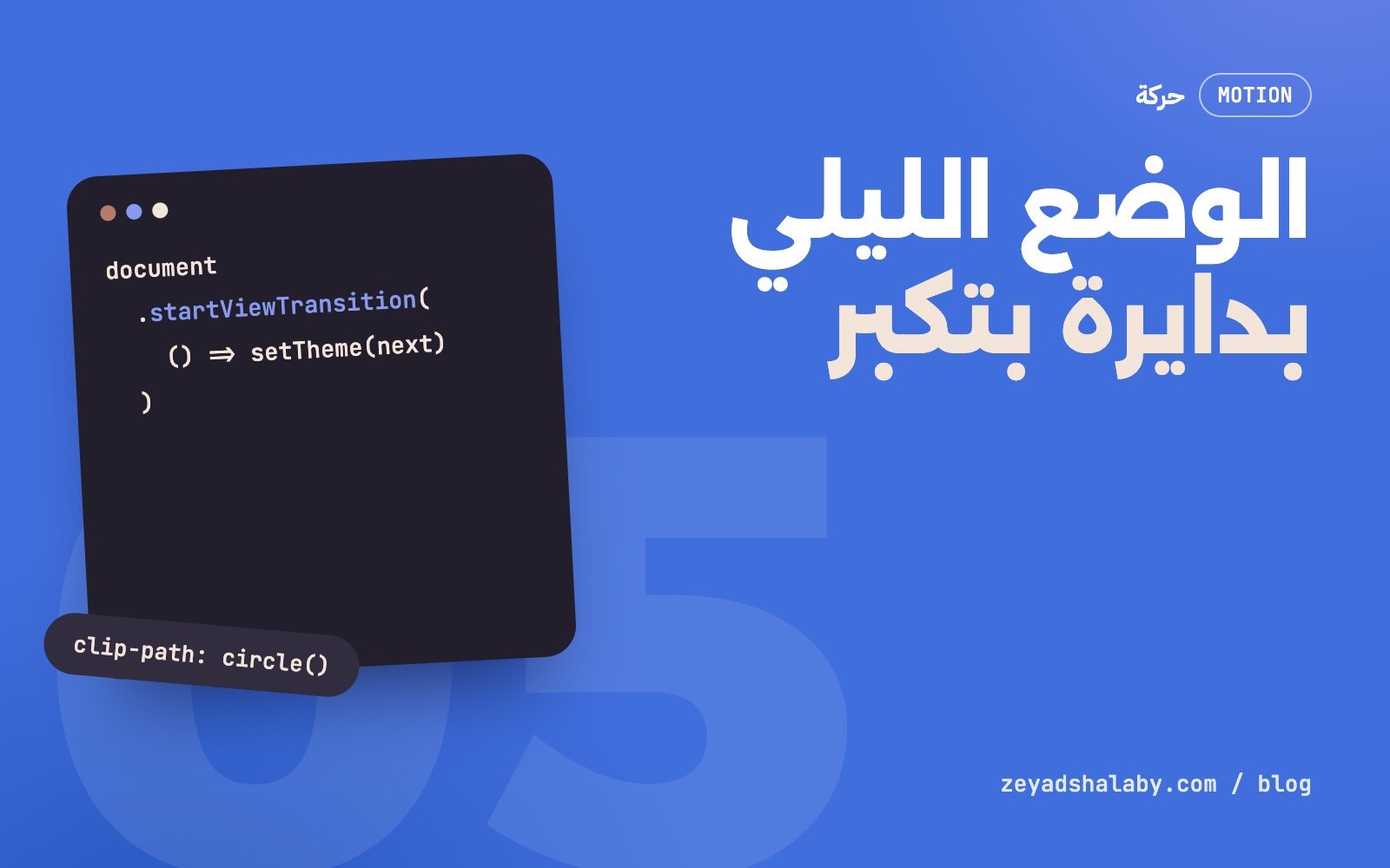
View Transitions API واجهة في المتصفح بتاخد صورة للصفحة قبل التغيير وصورة بعده، وتسيبك تحرك بين الاتنين بالـ CSS أو الجافاسكريبت. في الموقع ده استخدمتها عشان زرار الوضع الليلي: اللون الجديد بيفتح كدايرة من مكان الضغطة لحد ما يغطي الشاشة. الكود كله 12 سطر ومن غير أي مكتبة. جرب الزرار اللي فوق في الشريط وانت بتقرا.
الفكرة في جملة
بتنادي document.startViewTransition() وتديها دالة بتغير الصفحة. المتصفح بيعمل تلات حاجات بالترتيب:
- ياخد لقطة للصفحة زي ما هي دلوقتي.
- ينفذ دالتك، فالصفحة الحقيقية تتغير.
- يحط اللقطة القديمة والشكل الجديد فوق بعض كعنصرين وهميين:
::view-transition-old(root)و::view-transition-new(root).
الوضع الافتراضي إن القديم بيبهت والجديد بيظهر. احنا هنلغي ده ونقص الجديد على شكل دايرة بتكبر.
الكود كامل
ده الكود الشغال في الموقع زي ما هو:
var R = document.documentElement;
var calm = matchMedia('(prefers-reduced-motion:reduce)').matches;

button.addEventListener('click', function (e) {
  var next = R.dataset.theme === 'dark' ? 'light' : 'dark';
  if (!document.startViewTransition || calm) return setTheme(next);

  var x = e.clientX, y = e.clientY;
  var r = Math.hypot(Math.max(x, innerWidth - x), Math.max(y, innerHeight - y));

  document.startViewTransition(function () { setTheme(next); }).ready.then(function () {
    R.animate(
      { clipPath: ['circle(0px at ' + x + 'px ' + y + 'px)',
                   'circle(' + r + 'px at ' + x + 'px ' + y + 'px)'] },
      { duration: 650, easing: 'cubic-bezier(.4,0,.2,1)',
        pseudoElement: '::view-transition-new(root)' }
    );
  });
});
و setTheme دالة عادية بتغير data-theme على عنصر html وتحفظ الاختيار.
حساب نصف القطر
الدايرة لازم تكبر لحد ما توصل لأبعد ركن في الشاشة عن مكان الضغطة، وإلا هيفضل جزء مش متغطي.
Math.max(x, innerWidth - x) بتجيب أبعد مسافة أفقية (يمين ولا شمال)، ونفس الكلام للرأسي. Math.hypot بتحسب وتر المثلث من الاتنين، وده بالظبط بعد أبعد ركن. كده الدايرة بتقف عند حافة الشاشة مش بعدها، والتوقيت بيبقى مظبوط مهما كان مكان الزرار.
سطر الـ CSS اللي من غيره مش هتشتغل
::view-transition-old(root),
::view-transition-new(root) {
  animation: none;
  mix-blend-mode: normal;
}
ده بيلغي البهتان الافتراضي. من غيره القديم هيبهت في نفس وقت الدايرة والشكل هيطلع مهزوز. بعد السطر ده القديم ثابت تحت، والجديد فوقه بيتكشف بالدايرة بس.
وليه بستنى .ready؟ لأن العناصر الوهمية مش موجودة غير بعد ما المتصفح ياخد اللقطتين. لو حركت قبل كده مفيش حاجة هتتحرك.
المتصفحات القديمة واللي قافل الحركة
السطر ده بيحل الحالتين مع بعض:
if (!document.startViewTransition || calm) return setTheme(next);لو المتصفح ما يعرفش الواجهة، أو المستخدم مفعل تقليل الحركة في نظامه، اللون بيتبدل على طول من غير أي حركة. الوظيفة شغالة عند الكل، والحركة إضافة للي يقدر يشوفها. دي نفس القاعدة الأولى في قواعدي مع GSAP: المحتوى يشتغل حتى لو الحركة ما اشتغلتش.
أخطاء شائعة
- تغيير تقيل جوه الدالة. الصفحة بتبقى متجمدة لحد ما الدالة تخلص. خليها تغير خاصية واحدة وخلاص.
- مدة طويلة. أثناء الانتقال الصفحة مش بتستقبل ضغطات. 650 مللي ثانية كفاية، وأكتر من ثانية بيحسس إن الموقع بطيء.
- نسيان الـ transitions العادية. لو العناصر عليها
transitionعلى اللون، هتتحرك جوه اللقطة الجديدة وتبوظ الشكل. اللقطة لازم تبقى في حالتها النهائية. - استخدامها في كل حاجة. حركة زي دي حلوة لأنها نادرة. لو كل ضغطة فيها انتقال بملء الشاشة، الزائر هيزهق.
عايز تتعلم الحركة في الويب بالترتيب، من الأساسيات لحد السكرول والـ WebGL؟ ده اللي في كورس أنيميشن الويب بـ GSAP.
The View Transitions API is a browser interface that takes a snapshot of the page before a change and another after it, then lets you animate between the two with CSS or JavaScript. On this site I used it for the dark mode button: the new colour opens as a circle from the click point until it covers the screen. The whole thing is 12 lines with no library. Try the button in the bar above while you read.
The idea in one sentence
You call document.startViewTransition() and give it a function that changes the page. The browser does three things in order:
- Takes a snapshot of the page as it is now.
- Runs your function, so the real page changes.
- Stacks the old snapshot and the new state as two pseudo-elements:
::view-transition-old(root)and::view-transition-new(root).
By default the old one fades out and the new one fades in. We will cancel that and clip the new one to a growing circle.
The full code
This is the code running on this site, as is:
var R = document.documentElement;
var calm = matchMedia('(prefers-reduced-motion:reduce)').matches;

button.addEventListener('click', function (e) {
  var next = R.dataset.theme === 'dark' ? 'light' : 'dark';
  if (!document.startViewTransition || calm) return setTheme(next);

  var x = e.clientX, y = e.clientY;
  var r = Math.hypot(Math.max(x, innerWidth - x), Math.max(y, innerHeight - y));

  document.startViewTransition(function () { setTheme(next); }).ready.then(function () {
    R.animate(
      { clipPath: ['circle(0px at ' + x + 'px ' + y + 'px)',
                   'circle(' + r + 'px at ' + x + 'px ' + y + 'px)'] },
      { duration: 650, easing: 'cubic-bezier(.4,0,.2,1)',
        pseudoElement: '::view-transition-new(root)' }
    );
  });
});
setTheme is a plain function that changes data-theme on the html element and saves the choice.
Working out the radius
The circle has to grow until it reaches the screen corner farthest from the click, or part of the page stays uncovered.
Math.max(x, innerWidth - x) gives the longest horizontal distance (left or right), and the same for vertical. Math.hypot returns the hypotenuse of the two, which is exactly the distance to the farthest corner. The circle stops at the edge of the screen rather than beyond it, so the timing is right wherever the button sits.
The CSS line it will not work without
::view-transition-old(root),
::view-transition-new(root) {
  animation: none;
  mix-blend-mode: normal;
}
This cancels the default fade. Without it the old state fades while the circle grows and the result looks shaky. With it the old state sits still underneath, and the new one is revealed by the circle alone.
Why wait for .ready? Because the pseudo-elements only exist after the browser has taken both snapshots. Animate earlier and nothing moves.
Older browsers and reduced motion
One line handles both cases:
if (!document.startViewTransition || calm) return setTheme(next);If the browser does not know the API, or the user has reduced motion turned on, the colour simply switches with no animation. The feature works for everyone and the motion is an extra for those who can see it. It is the first rule in my GSAP rules: content works even when motion does not.
Common mistakes
- Heavy work inside the callback. The page is frozen until the function finishes. Change one attribute and stop.
- A long duration. The page does not take clicks during the transition. 650 ms is enough, and more than a second makes the site feel slow.
- Forgetting regular transitions. If elements have a colour
transition, they animate inside the new snapshot and spoil the effect. The snapshot must be in its final state. - Using it everywhere. A move like this is good because it is rare. If every click triggers a full-screen transition, visitors get tired of it.
Want to learn web motion in order, from the basics to scroll and WebGL? That is what the GSAP web animation course covers.
سيب تعليقLeave a comment