POSTتصميم واجهاتUI design
إزاي عملت فورم تواصل الناس بتكمله للآخرHow I built a contact form people actually finish
تلات خطوات، كلها اختيارات، وخانة الكتابة آخر حاجة. كل قرار في فورم zeyad.email وليه اتاخد.Three steps, all choices, typing comes last. Every decision behind the zeyad.email form and why.
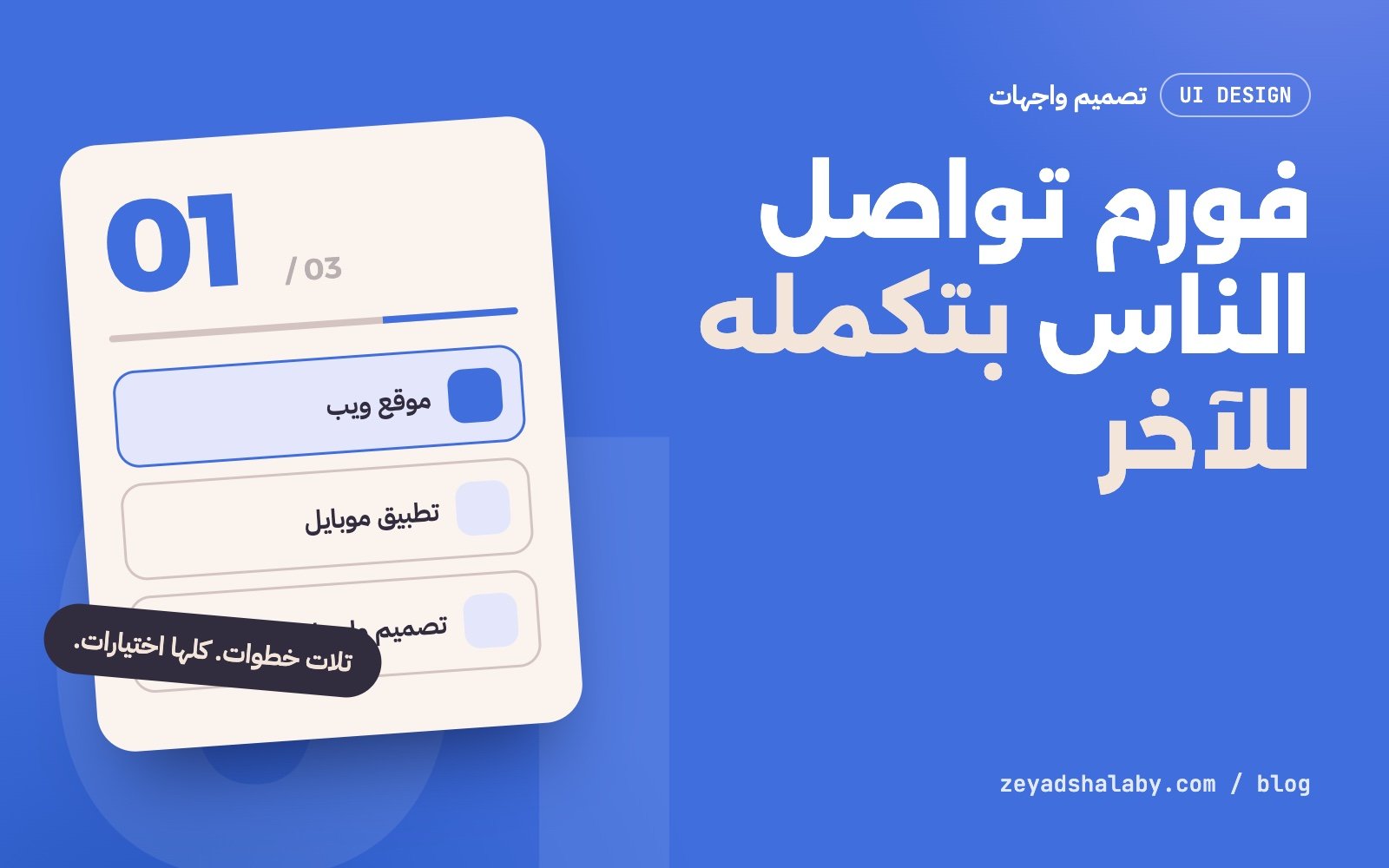
أغلب فورمات التواصل بتخسر الزائر من أول خانة: صندوق كبير فاضي مكتوب فوقه “اكتب رسالتك”. لما عملت صفحة zeyad.email قررت إن الزائر ما يكتبش غير اللي لازم يتكتب، والباقي كله اختيارات بضغطة.
المشكلة في الصندوق الفاضي
الزائر اللي عنده فكرة مشروع مش دايما عارف يبدأ منين. لما تديله صندوق نص فاضي انت بتطلب منه يعمل شغلك: يرتب أفكاره، ويقرر إيه المهم، ويكتبه بصياغة واضحة. ناس كتير بتقفل الصفحة عند النقطة دي.
الحل اللي مشيت عليه: أنا اللي أسأل، وهو يختار.
سؤال واحد في كل خطوة
قسمت الفورم لتلات خطوات، وكل خطوة ليها سؤال واحد واضح مكتوب بخط كبير:
- محتاج إيه بالظبط؟ ست كروت: موقع، تطبيق موبايل، تصميم واجهات، AI وأتمتة، استشارة، أو حاجة تانية.
- أرد عليك على مين؟ الاسم والإيميل، وتختار تحب أكلمك إيميل ولا واتساب ولا مكالمة.
- شوية تفاصيل عن المشروع: الميزانية، الوقت، والمشروع واصل لفين. كلها اختيارات.
أول خطوة مفيهاش ولا حرف كتابة. الزائر بيضغط على كارت والفورم بينقله للخطوة اللي بعدها لوحده. ده مقصود: أول تفاعل لازم يكون أسهل حاجة في الصفحة.
كل خانة كتابة زيادة هي سبب زيادة إن الزائر يمشي.
ملخص بيتبني قدام عينه
على جنب الفورم فيه لوحة غامقة فيها رقم الخطوة بخط كبير، وشريط تقدم، وقايمة بتتملى بكل اختيار الزائر عمله. الفايدة منها حاجتين:
- الزائر شايف هو فين وفاضل قد إيه، فمفيش مفاجآت.
- اختياراته قدامه طول الوقت، فلو غلط في حاجة يرجع يعدلها قبل ما يبعت.
خانة الرقم بتظهر لما تحتاجها بس
لو الزائر اختار إني أرد عليه بالإيميل، مفيش داعي أسأله عن رقمه. خانة الموبايل بتظهر بس لما يختار واتساب أو مكالمة. قاعدة بسيطة بس بتشيل خانة كاملة من قدام أغلب الناس.
// الخانة تظهر بس لو طريقة التواصل مش إيميل
const show = sel.contact !== 'email';
phoneWrap.hidden = !show;
الحماية من غير ما أزعج حد
مفيش كابتشا ومفيش “اختار كل الصور اللي فيها إشارة مرور”. الحماية كلها بتحصل من غير ما الزائر يحس:
- خانة مخفية: البشر مش بيشوفوها، والبوتات بتملاها. لو اتملت، السيرفر بيرد “تمام” وما يبعتش حاجة.
- حد أقصى للرسايل: خمس رسايل من نفس الجهاز كل عشر دقايق، وتلات رسايل تأكيد لنفس الإيميل في الساعة.
- التحقق مرتين: مرة في المتصفح عشان الزائر يعرف الغلط فورا، ومرة على السيرفر عشان ده اللي بيعتمد عليه فعلا.
إيميل التأكيد ما بيكررش كلام الزائر
الزائر بيوصله إيميل تأكيد إن رسالته وصلت، بس الإيميل ده مفيهوش نص رسالته. السبب: لو الفورم بيرجع أي نص يتكتب فيه لأي إيميل يتحط فيه، يبقى أي حد يقدر يستخدمه يبعت كلامه هو لناس تانية باسمي. فالتأكيد ثابت، وبياخد اسم الزائر بس، وده كمان لو كان اسم عادي من غير لينكات ورموز.
الخلاصة
- اسأل انت، وخلي الزائر يختار.
- سؤال واحد في كل خطوة، وأول خطوة تكون بضغطة.
- وريه هو فين واختار إيه.
- ما تسألش عن حاجة مش محتاجها.
- الحماية شغلك انت، مش شغل الزائر.
Most contact forms lose the visitor at the first field: a large empty box labelled “Write your message”. When I built zeyad.email I decided visitors would type only what has to be typed, and everything else would be a choice made with one tap.
The problem with the empty box
Someone with a project idea does not always know where to start. An empty text box asks them to do your job: sort their thoughts, decide what matters and phrase it clearly. Many people close the page right there.
My answer: I ask, they choose.
One question per step
The form has three steps, each with one clear question in large type:
- What do you need? Six cards: website, mobile app, UI design, AI and automation, consulting, or something else.
- Who do I reply to? Name and email, plus how you want to be reached: email, WhatsApp or a call.
- A few project details: budget, timeline and how far along it is. All choices.
The first step has no typing at all. The visitor taps a card and the form moves on by itself. That is deliberate: the first interaction should be the easiest thing on the page.
Every extra text field is one more reason to leave.
A summary that builds as they go
Beside the form sits a dark panel with the step number in large type, a progress line and a list that fills with each choice. It does two things:
- Visitors see where they are and how much is left, so nothing surprises them.
- Their choices stay in view, so a mistake gets fixed before sending.
The phone field appears only when needed
If the visitor wants an email reply, there is no reason to ask for a number. The phone field shows only for WhatsApp or a call. A small rule that removes a whole field for most people.
// Show the field only when the contact method is not email
const show = sel.contact !== 'email';
phoneWrap.hidden = !show;
Protection that bothers no one
No captcha, no “select every image with a traffic light”. The protection happens without the visitor noticing:
- A hidden field: people never see it, bots fill it. If it is filled, the server answers “ok” and sends nothing.
- Rate limits: five messages per device every ten minutes, and three confirmation emails per address an hour.
- Validation twice: in the browser so the visitor sees the problem at once, and on the server because that is the one that counts.
The confirmation never repeats the visitor’s words
Visitors get an email confirming their message arrived, but it does not contain their text. If a form sends back whatever is typed to whatever address is entered, anyone can use it to send their own words to other people under my name. So the confirmation is fixed and only uses the visitor’s name, and only when it is a plain name without links or symbols.
In short
- You ask, the visitor chooses.
- One question per step, and the first step is a tap.
- Show where they are and what they picked.
- Do not ask for what you do not need.
- Protection is your job, not the visitor’s.
التعليقاتComments
اقرا كمانRead next
 ويبWeb
4 دقايق قرايةmin read
:has() في CSS: سبع استخدامات بتشيل جافاسكريبت من موقعك:has() in CSS: seven uses that remove JavaScript from your site
ويبWeb
4 دقايق قرايةmin read
:has() في CSS: سبع استخدامات بتشيل جافاسكريبت من موقعك:has() in CSS: seven uses that remove JavaScript from your site
 ويبWeb
4 دقايق قرايةmin read
Container Queries: الكارت اللي بيتظبط حسب مكانه مش حسب الشاشةContainer queries: a card that adapts to its place, not the screen
ويبWeb
4 دقايق قرايةmin read
Container Queries: الكارت اللي بيتظبط حسب مكانه مش حسب الشاشةContainer queries: a card that adapts to its place, not the screen
سيب تعليقLeave a comment