POSTويبWeb
Container Queries: الكارت اللي بيتظبط حسب مكانه مش حسب الشاشةContainer queries: a card that adapts to its place, not the screen
ليه media queries مش كفاية للمكونات، وإزاي تكتب @container صح، ووحدات cqi، وأخطاء أول مرة.Why media queries fall short for components, how to write @container properly, cqi units, and first-time mistakes.
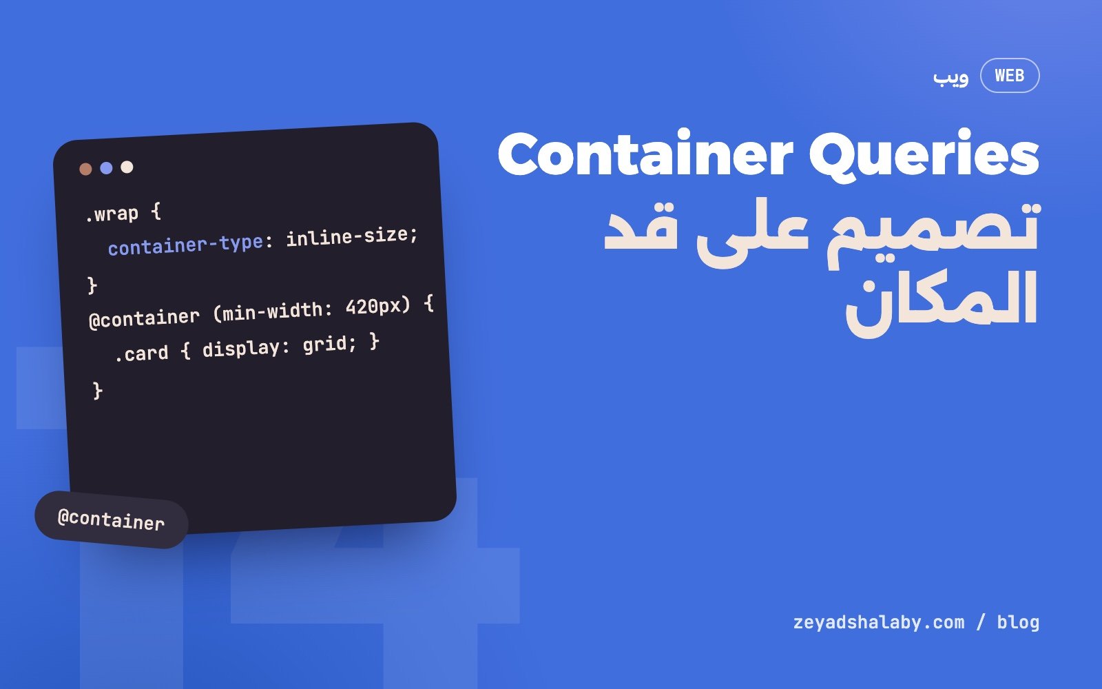
Container Queries بتخليك تغير شكل عنصر حسب عرض الحاوية اللي هو جواها، مش حسب عرض الشاشة. نفس الكارت يبقى أفقي لما يتحط في عمود واسع، ورأسي لما يتحط في شريط جانبي ضيق، من غير ما تكتبله كلاس مختلف لكل مكان. الميزة مدعومة في كل المتصفحات الحديثة من 2023، فتقدر تستخدمها النهارده.
المشكلة مع media queries
الـ media query بتسأل سؤال واحد: الشاشة عرضها كام؟ ده مناسب لتخطيط الصفحة كلها، ومش مناسب للمكونات.
خد كارت منتج. في الصفحة الرئيسية هو في شبكة من تلات أعمدة. في صفحة المقال هو في شريط جانبي عرضه 300 بكسل. والشاشة في الحالتين 1440 بكسل. الـ media query هتقول للكارت “انت على شاشة كبيرة، خليك أفقي”، وهو محشور في 300 بكسل.
الحل القديم كان كلاسات زي .card--sidebar و .card--wide، وكل مكان جديد يتحط فيه الكارت محتاج كلاس جديد. الكارت بقى لازم يعرف هو فين، وده عكس فكرة المكون.
الأساس في تلات سطور
خطوتين: تعرف الحاوية، وبعدين تسأل عن عرضها.
.card-wrap {
  container-type: inline-size;
}

@container (min-width: 420px) {
  .card {
    display: grid;
    grid-template-columns: 160px 1fr;
    gap: 20px;
  }
}
container-type: inline-size معناها: “العنصر ده حاوية، وولاده يقدروا يسألوا عن عرضه”. و @container بتتكتب زي @media بالظبط، بس القياس على أقرب حاوية مش على الشاشة.
دلوقتي الكارت أفقي لما مكانه 420 بكسل أو أكتر، ورأسي لما يبقى أضيق. في أي صفحة، وفي أي عمود.
تسمية الحاويات
لو عندك حاويات جوه بعض، @container من غير اسم بتقيس على أقرب واحدة. لما تعوز واحدة معينة، سميها:
.sidebar { container: sidebar / inline-size; }
.grid    { container: grid / inline-size; }

@container sidebar (max-width: 320px) {
  .card__meta { display: none; }
}
container اختصار للاسم والنوع مع بعض. التسمية بتخلي الكود يتقرا: واضح إن القاعدة دي بتخص الشريط الجانبي.
وحدات الحاوية: cqi
زي ما vw هي 1% من عرض الشاشة، cqi هي 1% من عرض الحاوية. دي بتفتح حاجة حلوة: خط بيكبر مع المكون مش مع الشاشة.
.card__title {
  font-size: clamp(1.1rem, 4cqi + 0.5rem, 2rem);
}

.card { padding: clamp(12px, 4cqi, 32px); }
العنوان بيكبر بهدوء كل ما الكارت يوسع، وواقف عند حد أدنى وأقصى. استخدم cqi مش cqw لو موقعك فيه عربي أو أي كتابة باتجاه مختلف، لأن cqi بتمشي مع اتجاه الكتابة. نفس منطق الخصائص المنطقية في CSS للمواقع العربي.
مثال كامل: كارت مقال
<div class="post-wrap">
  <article class="post">
    <img class="post__img" src="cover.jpg" alt="...">
    <div class="post__body">
      <h3 class="post__title">عنوان المقال</h3>
      <p class="post__excerpt">سطرين عن المقال.</p>
    </div>
  </article>
</div>
.post-wrap { container: post / inline-size; }
/* الأساس: الشكل الضيق */
.post { display: grid; gap: 12px; }
.post__img { aspect-ratio: 16 / 9; width: 100%; object-fit: cover; }
.post__excerpt { display: none; }
/* متوسط: الصورة جنب النص */
@container post (min-width: 420px) {
.post { grid-template-columns: 40% 1fr; align-items: center; gap: 20px; }
.post__img { aspect-ratio: 1; }
}
/* واسع: نظهر المقتطف */
@container post (min-width: 640px) {
.post__excerpt { display: block; }
.post__title { font-size: 1.6rem; }
}ابدأ دايما بالشكل الضيق كأساس وزود عليه. ده بيضمن إن المتصفح اللي مش فاهم @container يطلع شكل مقبول.
أخطاء أول مرة
- العنصر بيسأل عن نفسه. الحاوية ما تقدرش تغير نفسها بناء على عرضها. القاعدة جوه
@containerلازم تستهدف عنصر جواها. عشان كده في المثال فيه.post-wrapحوالين.post. - الحاوية عرضها بقى صفر.
container-type: inline-sizeبتخلي العنصر ما يتحددش عرضه من محتواه. لو الحاوية عنصر inline أو جوه flex من غير عرض، ممكن تنكمش. اديها عرض واضح أو خليها تتمدد. - استخدام
sizeمن غير سبب.container-type: sizeبتقيس العرض والارتفاع، وبتطلب إن الارتفاع يبقى محدد. في 95% من الحالاتinline-sizeهي اللي عايزها. - استبدال كل media queries. تخطيط الصفحة نفسه (كام عمود، الشريط الجانبي فين) لسه شغل
@media. القاعدة: الصفحة بـ media، والمكون بـ container. - حاوية على كل حاجة. كل حاوية ليها تكلفة صغيرة في الحساب. حطها حوالين المكونات اللي فعلا بتتحط في أماكن بعروض مختلفة.
الصفحة تسأل عن الشاشة. المكون يسأل عن مكانه.
إمتى أستخدمها
- كارت بيظهر في شبكة وفي شريط جانبي وفي سلايدر.
- مكون في design system هيستخدمه ناس في أماكن انت مش عارفها.
- لوحة تحكم فيها ألواح المستخدم بيكبرها ويصغرها.
- أي حاجة بتلاقي نفسك بتكتبلها كلاس مختلف لكل مكان.
الميزة دي واحدة من كذا حاجة جديدة في CSS بتشيل شغل كان بيتعمل بالجافاسكريبت. شوف كمان :has() في CSS و Scroll-driven animations. ولو لسه بتبني أساسك في الويب، ابدأ من خريطة تعلم برمجة المواقع.
Container queries let you change an element’s look based on the width of the container it sits in, not the width of the screen. The same card becomes horizontal in a wide column and vertical in a narrow sidebar, without a different class for each place. They have been supported in all modern browsers since 2023, so you can use them today.
The problem with media queries
A media query asks one question: how wide is the screen? That suits page layout and does not suit components.
Take a product card. On the home page it sits in a three-column grid. On an article page it sits in a 300-pixel sidebar. The screen is 1440 pixels in both cases. The media query tells the card “you are on a big screen, go horizontal” while it is squeezed into 300 pixels.
The old fix was classes like .card--sidebar and .card--wide, with a new class for every new place. The card had to know where it was, which is the opposite of what a component is.
The basics in three lines
Two steps: define the container, then ask about its width.
.card-wrap {
  container-type: inline-size;
}

@container (min-width: 420px) {
  .card {
    display: grid;
    grid-template-columns: 160px 1fr;
    gap: 20px;
  }
}
container-type: inline-size means “this element is a container, and its descendants may ask about its width”. @container is written exactly like @media, but measured against the nearest container instead of the screen.
Now the card is horizontal when its place is 420 pixels or more, and vertical when narrower. On any page, in any column.
Naming containers
With nested containers, an unnamed @container measures the nearest one. When you want a specific one, name it:
.sidebar { container: sidebar / inline-size; }
.grid    { container: grid / inline-size; }

@container sidebar (max-width: 320px) {
  .card__meta { display: none; }
}
container is shorthand for name and type together. Naming makes the code readable: it is clear this rule is about the sidebar.
Container units: cqi
Just as vw is 1% of the screen width, cqi is 1% of the container width. That opens something nice: type that scales with the component, not the screen.
.card__title {
  font-size: clamp(1.1rem, 4cqi + 0.5rem, 2rem);
}

.card { padding: clamp(12px, 4cqi, 32px); }
The title grows gently as the card widens, held between a minimum and a maximum. Use cqi rather than cqw if your site has Arabic or any other writing direction, because cqi follows the writing direction. The same reasoning as logical properties in CSS for Arabic sites.
A full example: a post card
<div class="post-wrap">
  <article class="post">
    <img class="post__img" src="cover.jpg" alt="...">
    <div class="post__body">
      <h3 class="post__title">Post title</h3>
      <p class="post__excerpt">Two lines about the post.</p>
    </div>
  </article>
</div>
.post-wrap { container: post / inline-size; }
/* base: the narrow layout */
.post { display: grid; gap: 12px; }
.post__img { aspect-ratio: 16 / 9; width: 100%; object-fit: cover; }
.post__excerpt { display: none; }
/* medium: image beside text */
@container post (min-width: 420px) {
.post { grid-template-columns: 40% 1fr; align-items: center; gap: 20px; }
.post__img { aspect-ratio: 1; }
}
/* wide: show the excerpt */
@container post (min-width: 640px) {
.post__excerpt { display: block; }
.post__title { font-size: 1.6rem; }
}Always start with the narrow layout as the base and add to it. That way a browser that does not understand @container still gets an acceptable result.
First-time mistakes
- The element querying itself. A container cannot restyle itself based on its own width. A rule inside
@containermust target something inside it. That is why the example has.post-wraparound.post. - The container collapsing to zero.
container-type: inline-sizestops the element from sizing to its content. If the container is inline or inside a flex row with no width, it may shrink. Give it a clear width or let it stretch. - Using
sizefor no reason.container-type: sizemeasures width and height and requires a defined height. In 95% of casesinline-sizeis what you want. - Replacing every media query. Page layout itself (how many columns, where the sidebar goes) is still a job for
@media. The rule: page by media, component by container. - A container on everything. Each container has a small calculation cost. Put them around components that really live in places of different widths.
The page asks about the screen. The component asks about its place.
When to use them
- A card shown in a grid, a sidebar and a slider.
- A design system component others will use in places you do not know.
- A dashboard with panels the user resizes.
- Anything for which you keep writing a different class per location.
This is one of several newer CSS features that remove work once done in JavaScript. See also :has() in CSS and scroll-driven animations. If you are still building your web foundations, start from the web development learning roadmap.
التعليقاتComments
اقرا كمانRead next
 ويبWeb
4 دقايق قرايةmin read
:has() في CSS: سبع استخدامات بتشيل جافاسكريبت من موقعك:has() in CSS: seven uses that remove JavaScript from your site
ويبWeb
4 دقايق قرايةmin read
:has() في CSS: سبع استخدامات بتشيل جافاسكريبت من موقعك:has() in CSS: seven uses that remove JavaScript from your site
 حركةMotion
4 دقايق قرايةmin read
Scroll-driven animations في CSS: حركة مع السكرول من غير جافاسكريبتCSS scroll-driven animations: scroll motion without JavaScript
حركةMotion
4 دقايق قرايةmin read
Scroll-driven animations في CSS: حركة مع السكرول من غير جافاسكريبتCSS scroll-driven animations: scroll motion without JavaScript
سيب تعليقLeave a comment